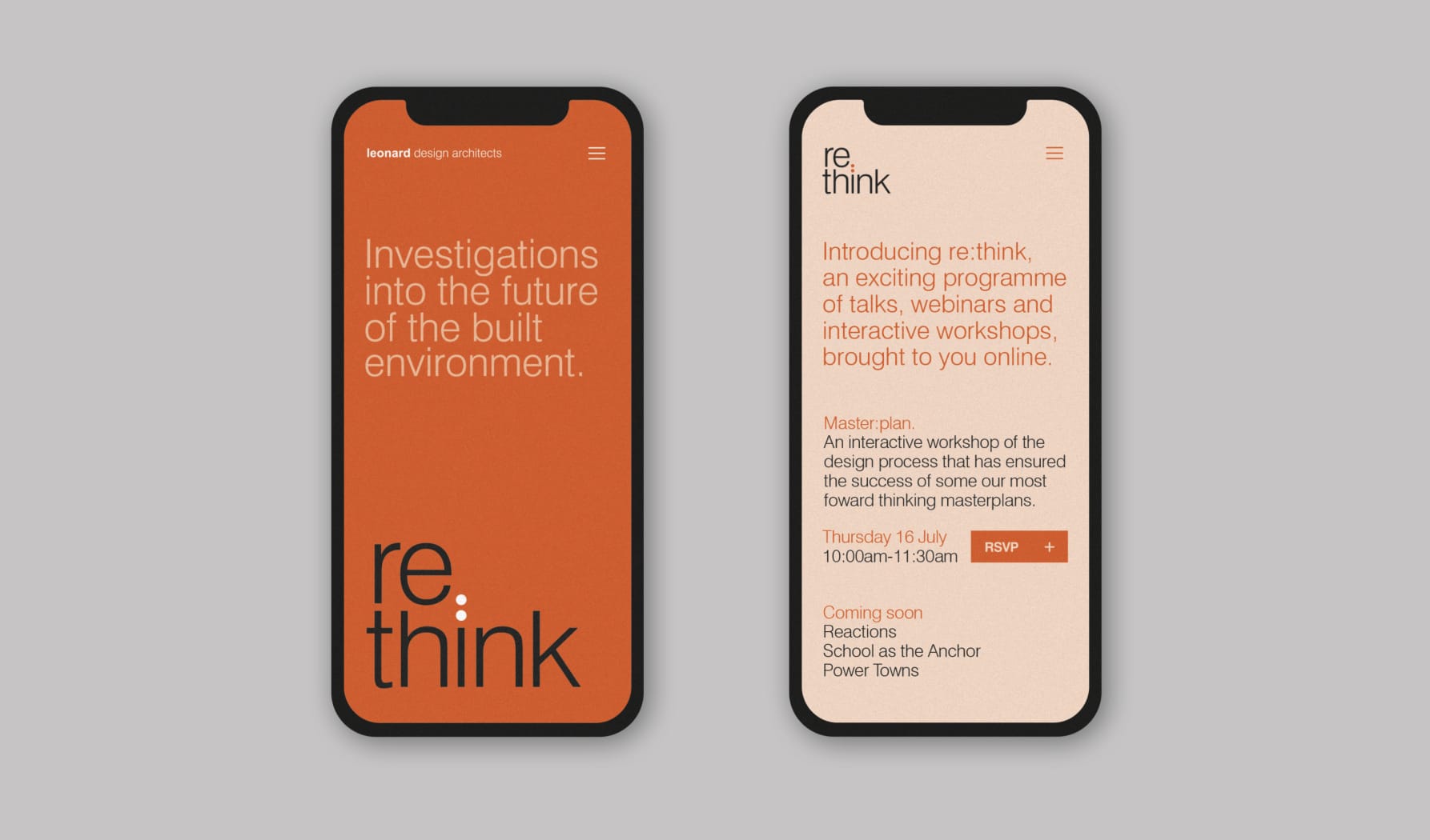
A visual identity system of logo, illustrations, info graphics and mailer designs for Re:think; a series of exciting talks, webinars and interactive workshops, showcased by Leonard Design online every month.
We took the brand name and core values as having a double meaning; as a way of rethinking the world around us, putting a new, innovative slant on things, as well as reviewing hot topics, themes and issues.
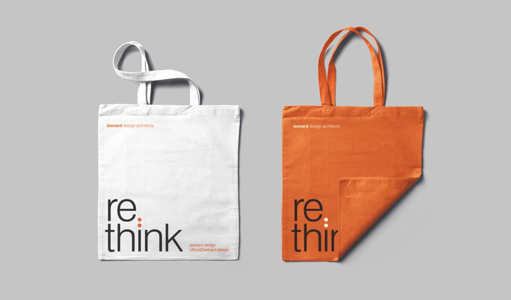
As such we divided the word into two parts, stacked, with a colon linking them which conveniently aligning the words. This ‘witty’ play on the design and elegant typography also incorporates a strong, punchy and identifiable colour scheme.
The brand is implemented across a range of digital media from website graphics to social media posts and mailers. Each webinar theme is represented by a graphic illustration on all emailers and promotions, often a visual pun with a varied style and approach from talk to talk.
Service
Naming
Identity Design
Layout
Illustration
Digital