Work Life is a coworking concept that creates and provides spaces for people not content with the ordinary, catering specifically for the needs of a modern work/life balance.
Our approach took the two component words and their meaning to be a kind of yin and yang, complementary principles, portraying harmony and codependency. We wanted to create a highly aspirational brand, a sense of ownership for people who love what they do, but understand the need for balance in their life.
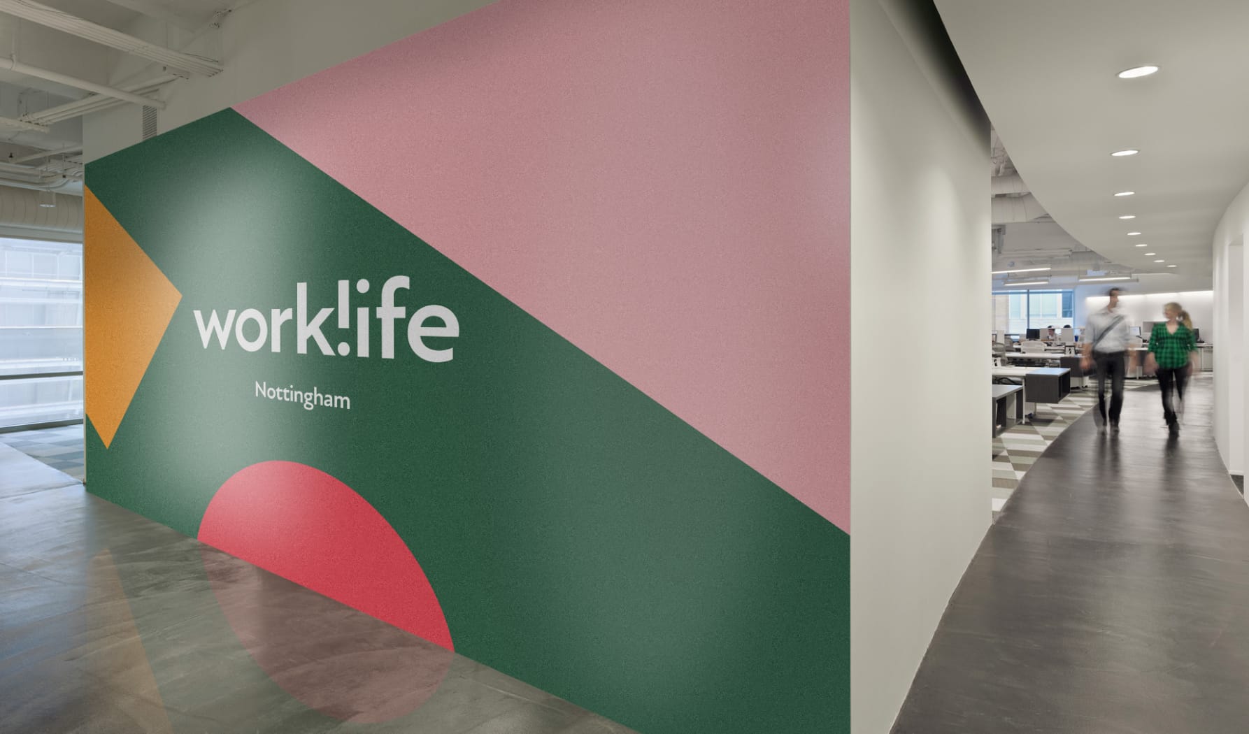
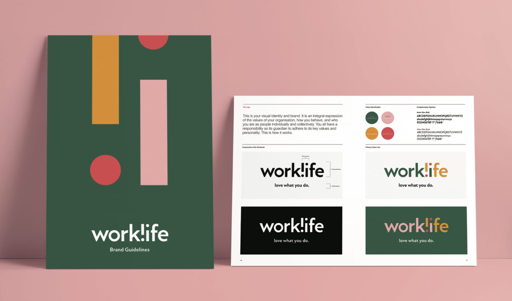
The identity was designed as a visual pun based around the interaction of these words and letter forms, literally reflecting the core brand concept of balancing work and everyday life. The design centred on a simple mirrored and rotated typographic form connecting the two words. The use of an exclamation mark gave an added energy, a proclamation amidst a sea of competing coworking brands. This also gave extra possibilities as a motif that could be enlarged, rotated and cropped to become a more abstract and decorative backdrop.
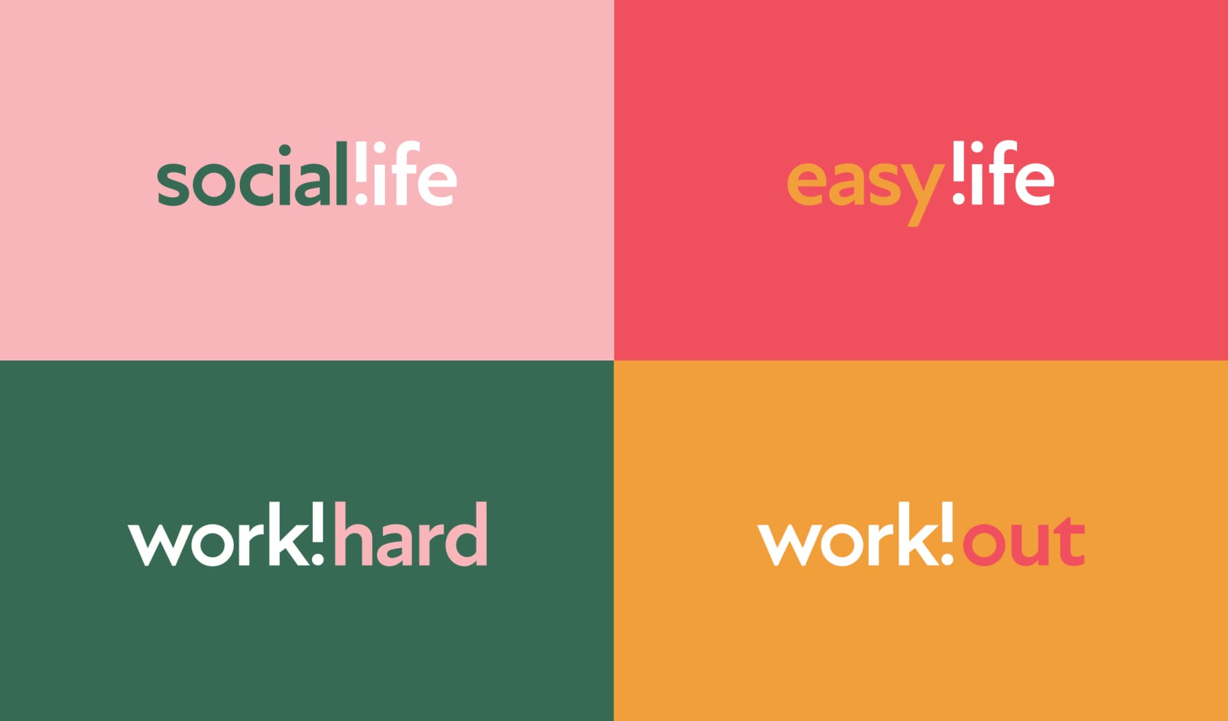
We also expanded the reach of the branding with a play on words communicating core brand values, ‘work hard’, ‘social life’ etc. This theming, as well as the general roll out of the brand identity, was closely coordinated with the interior design scheme on wall murals, supergraphics and signage, as well as a range of apparel and proposed merchandising.
Service
Naming
Logo Design
Environmental Graphics
Signage