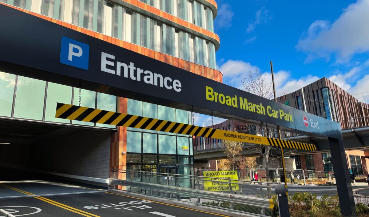
As part of the Nottingham Southside redevelopment programme, a comprehensive signage and wayfinding solution for a new landmark transport hub; a bus terminal and multi-storey car park which is a key part of a rejuvenated gateway to the city.
The design concept embraces the City of Nottingham, its history, culture, sporting legacy, local character and its people. We wanted to create a real sense of place, bring life and meaning to each space, enhance the visitor experience, and push the boundaries of what is much more than just a car park and bus station, but a significant gateway to the city.
At the heart of our approach was a vibrant and energetic mural design with a vast array of city themed illustrations, from which we pulled six key icons: City of Learning; Market Square; Goose Fair; Robin Hood; The Castle, and the Theatre District.
The main mural would feature throughout the bus terminal concourse, linking through welcome halls and colour coded car park levels above, with each deck having its own identity based around a single icon. This created a clear and memorable visual language, reinforcing the sense of vertical and horizontal orientation for the end-user. The use of font weights, illustration style, layout and colour palette established a consistent tone of voice, and distinctive, instantly recognisable sign messaging.
The full scope of signage interventions was established as part of a rigorous wayfinding strategy, working in close collaboration with the client and project team. This was vital to achieve a carefully coordinated visitor journey, from external façade signage and arrival, entrance identification, concourse wayfinding, level identification, vertical circulation and enhanced welcome halls, amenities and services, vehicle directional signs, and ultimately the departure experience.
Service
Placemaking and Identity
Environmental Graphics
Wayfinding
Signage Design

